Branding
The Problem
– Inconsistent theme –
– No defined color scheme –
– No brand imagery –
– Multiple graphic designers –
The Solution
– Created color scheme using logo pantones –
– Designed “green vine” as brand image –
– Consistent fonts –
– One designer creates all media –
Case Study
When I began working with RenVision, their marketing pieces were all over the place. As a business that relied heavily on television and newspaper advertising, this was a serious problem. And without an in-house designer, creating a consistent theme was an impossible task for the team.
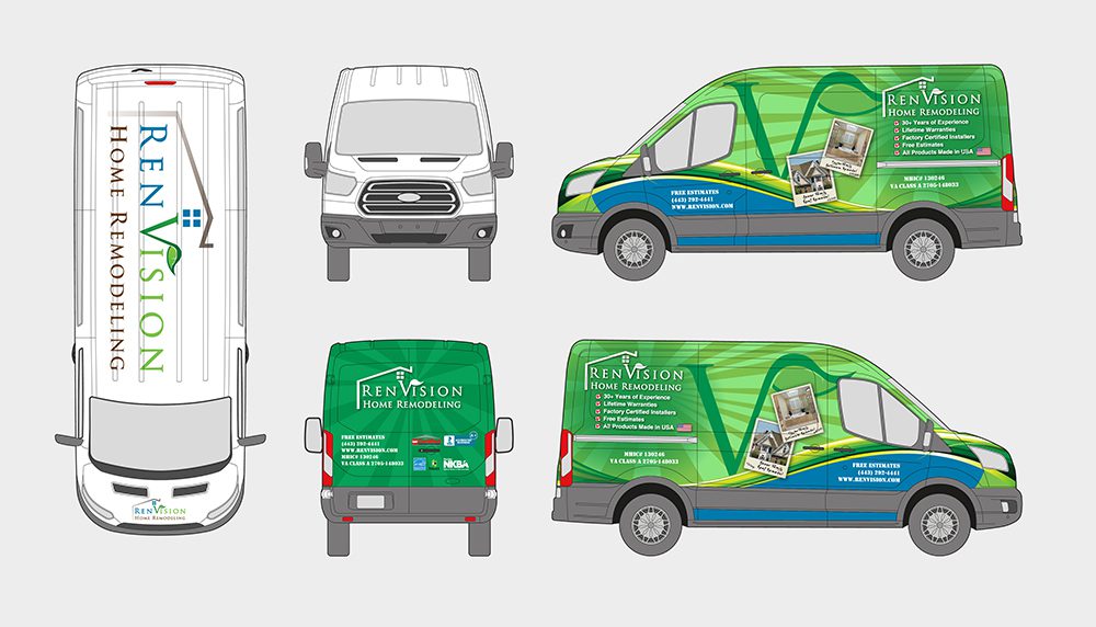
The good thing is RenVision president Brian Bauer recognized the issue and had a vision in mind. He wanted to use shades of green and blue and create a similar theme across all media.
I began by creating some gradients using colors from the RenVision logo and then used those to design some consistent imagery that conveyed a sense of energy, efficiency, and sustainability. The “green vine” was a key element in the branding and is now a part of their storefront, vans, and all advertising.
Click here to see Brian’s testimonial.

Renvision Pitchbook Cover
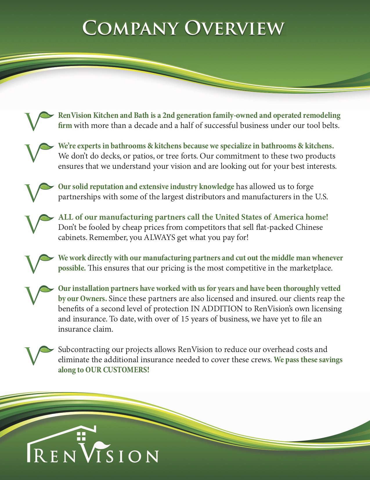
Renvision Company Overview
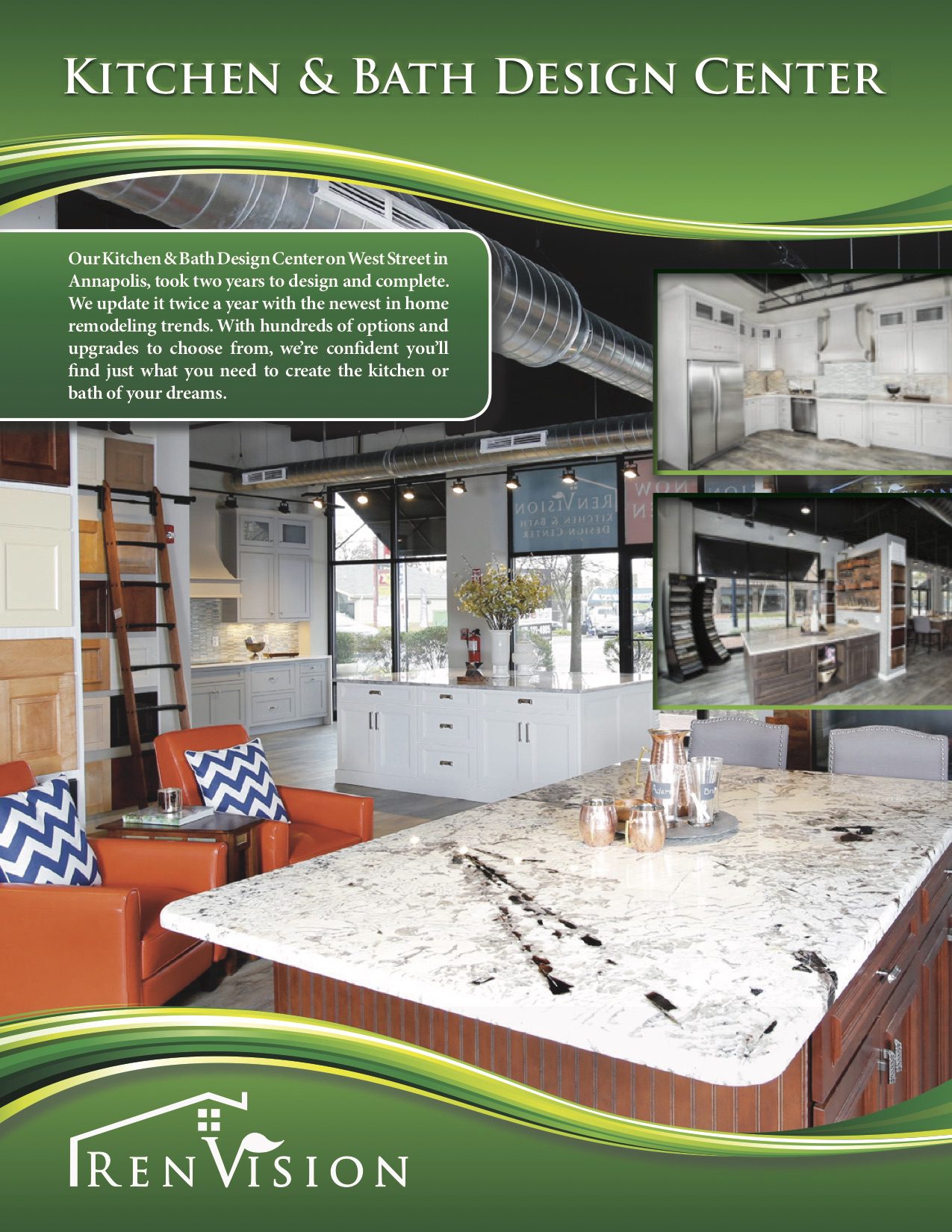
Renvision Design Center
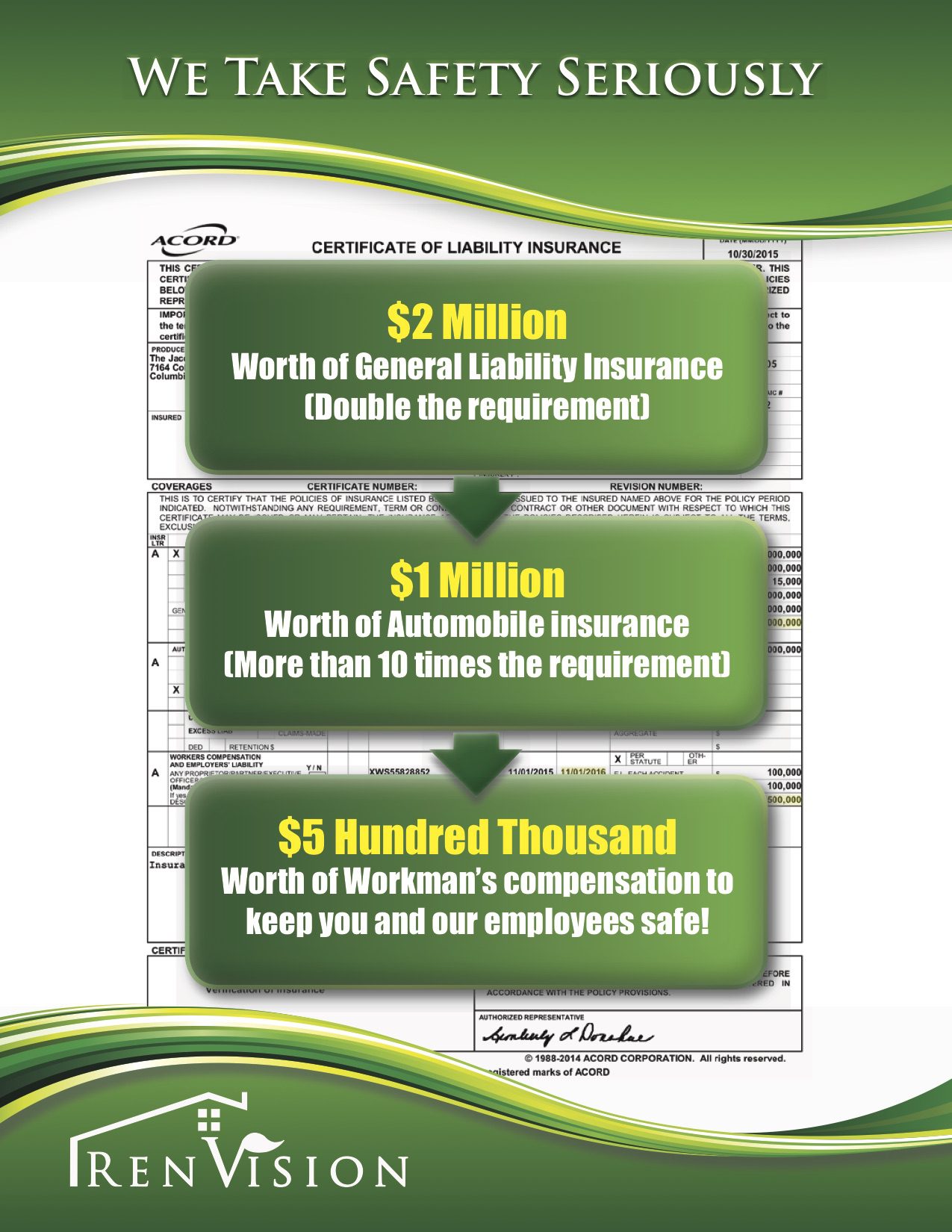
Renvision Pitchbook Interior
PowerPoint Slide Cover
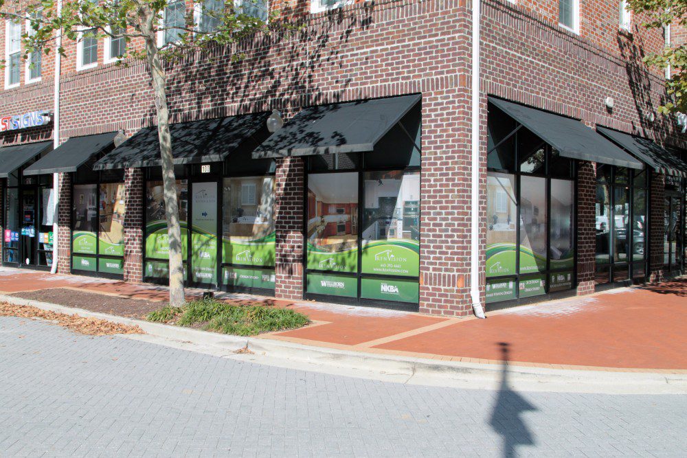
Storefront Ad Display

Pandora Ad